top of page
RABIA
IMAAN
QADEER
STAGE 4
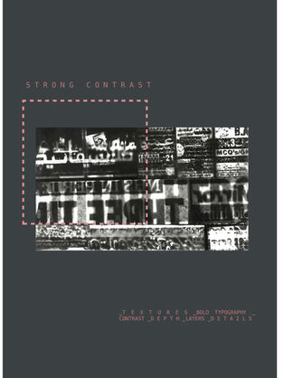
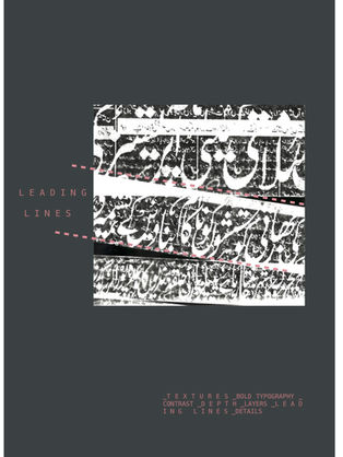
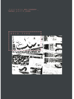
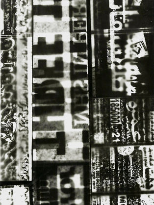
For STAGE 4, I decided to further look at typography/text, therefore I chose look into the work of Raoul Hausmann. I really liked Hausmann's style of collage as well as his use of black bold letters ( these letters have been taken from newspapers and magazines) amongst the collage. Therefore I decided to experiment with areas of bold text from newspapers, layering them to create digital negatives - forming a unique collage compositions.
CRITICAL LINK

1 2

1 2
1/1
CONTACT SHEET
P R O C E S S
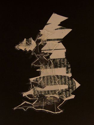
To create these digital negatives I cut sections of bold text out from British and Pakistani newspapers. layered them together, exposed the images, then turned them into negatives in the darkroom.
ANNOTATIONS
LEVELLED SELECTIONS
CRITICAL LINK 2
P R O C E S S
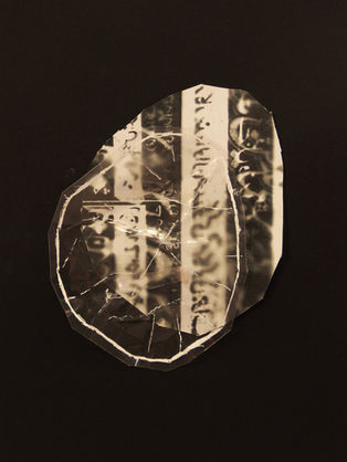
For these developments, I was inspired by Nigel Henderson cracked glass effect - this effect resulted in bold black and white contrasting marks. Therefore this lead me to create a similar effect of my own; I created this effect through scrunching acetate and highlighting the creases and bends using a white marker.
As my previous pieces of work throughout this project have had connections to me, my culture and where I'm from - I decided to form developments to further reflect this too. Therefore I used my newspaper negatives to create cut outs of maps, I then did the same with the acetate. The acetate allows to emphasise the shapes and ridges of the maps as well as adding and exaggerating textures within my developments.
DEVELOPMENTS
U N I T E D K I N G D O M
M A N C H E S T E R
B U R Y
P AK I S T A N
G U J R A T
H A Y A T G H A R
CHEMIGRAM DEVELOPMENTS
bottom of page


